
This work is licensed under a Creative Commons License.
Here's the background links for readers who wish to catch up:
The similarity of the two histograms and the curves provided by the author is obvious. He gets smother courves of ourse but this is because he uses a larger sample (1,000,000 vs. 1,000) and than he further amplifies the sample by repeatedly selection the winner only.Huh? Wait! That's how elections are SUPPOSED to work, there's only supposed to be one winner. This is not a matter of "further amplifies the sample", this is the intrinsic structure of the electoral process. You count the votes, and then whoever gets the most votes becomes the winner. The candidate who comes second place is exactly the same as the candidate who comes third place, or the candidate who comes last for that matter -- none of these people were the winner. Attempting to average it out by allocating the probability of a win proportional to the number of votes delivers a completely garbage answer. This is the key aspect of the democratic system which is ruling out lower quality candidates.
Each time you want to try the whole election again, you need to go back and clear all the tally counters then start generating a full new set of votes.
That's the critical step missing from the original Mato Nagel article from 2010.
Here's the link to Wikipedia: Probability Density Function
In probability theory, a probability density function (PDF), or density of a continuous random variable, is a function, whose value at any given sample (or point) in the sample space (the set of possible values taken by the random variable) can be interpreted as providing a relative likelihood that the value of the random variable would equal that sample. In other words, while the absolute likelihood for a continuous random variable to take on any particular value is 0 (since there are an infinite set of possible values to begin with), the value of the PDF at two different samples can be used to infer that, in any particular draw of the random variable, how much more likely it is that the random variable would equal one sample compared to the other sample.
So when you have a bunch of discrete samples, you can make a histogram based on various different choices of the buckets you spread the samples into (which can be chosen various way) and the actual probability of a given bucket depends on how you choose the bounds of that bucket as well as the samples themselves. Since no given dataset is 100% perfect (i.e. all real data is merely a random sample, not the full distribution) the purpose of the histogram is to make an ESTIMATE which helps you discover the true probability density function (PDF). Proper statistical tools like "R" have library functions that will take discrete samples and generate a best estimate of probability density. A histogram is merely a very simple method for attempting that estimate.
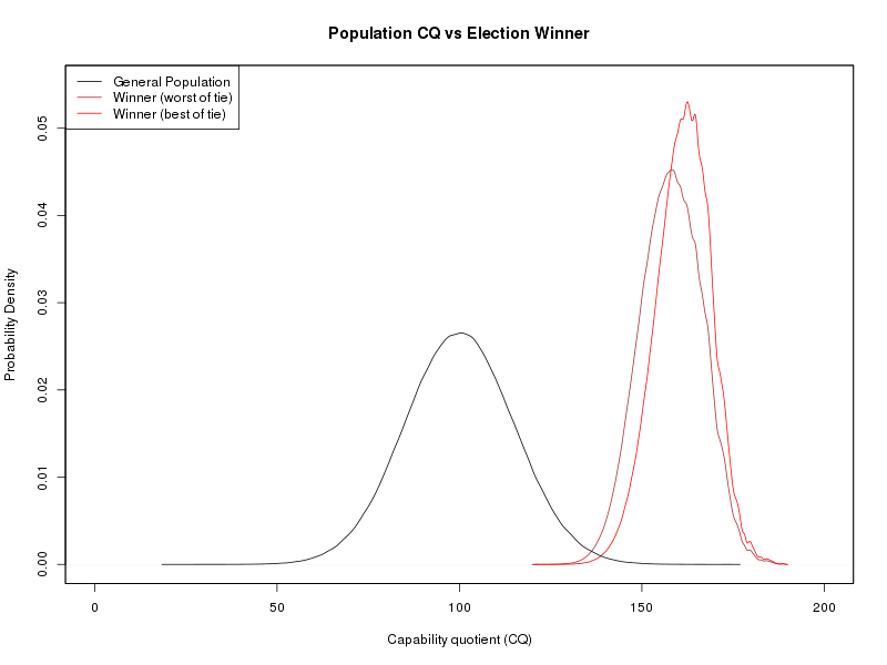
One of the fundamental properties of the probability density function (PDF) is that the area under the function (i.e. the total probability) must come to exactly 1 (i.e. 100% which is certainty). You see the same thing in a histogram so that when you add up the total of each bar that total must necessarily come to 1 (i.e. 100% of the samples in the data set). So let's look at this diagram:
| Number of Samples | Run Time for Python Generation and Output | Run Time for C Generation and Output | Speed Difference |
|---|---|---|---|
| 1000 | 2.100 seconds | 0.004 seconds | 525.0 times faster |
| 5000 | 2.223 seconds | 0.010 seconds | 222.3 times faster |
| 10000 | 2.283 seconds | 0.015 seconds | 152.2 times faster |
| 50000 | 2.364 seconds | 0.052 seconds | 45.5 times faster |
| 100000 | 2.531 seconds | 0.095 seconds | 26.6 times faster |
| 500000 | 4.312 seconds | 0.473 seconds | 9.1 times faster |
| 1000000 | 7.147 seconds | 0.944 seconds | 7.6 times faster |
Code for Python is: Mato_Nagel_python_2017-08-04_A.py.
Code for C is: Mato_Nagel_comparison_2017-08-04_A.c.
Just a side note, while testing this I discovered the very important missing line in the original little bit of Python code "import random" which makes you wonder how that version ever worked without importing the correct library. Although the Python code is shorter, that is ONLY because it pulls more stuff from outside libraries and then there's the problem of finding all the correct libraries to make the thing work properly (e.g. scipy, numpy, python-matplotlib, etc). I have no problem in principle with using libraries, but just for the sake of making the code a bit smaller it also makes it more difficult for anyone else to reproduce the output, depending on whether others can reliably get hold of equivalent libraries.
A lot of the slowdown in Python is the startup cost (e.g. loading libraries, bootstrap the interpreter, etc) but even as it converges for large numbers of samples, the C code is almost an order of magnitude faster. I think my point is made, massive speed improvements can make a difference... speed allows larger sample sizes which produce more accurate answers. I'm talking about REAL ANSWERS not faking it with a transformed curve that happens to be completely wrong.
With slow and cumbersome tools, the user is tempted to just look at rough estimates with 1000 samples, and to say, "Hey good enough" then never bother looking further than that.
By the authors idea simply the majority of voters would have selected a candidate with CQ of 150 which is almost exactly half way from 100 to 200 the upper CQ limit the author allows to his sample. He would have soon realize that there is something wrong with his software if he allowed an CQ of 500 as in the sample below.
This is completely wrong on several levels.
Actually the answer I got was never 150, just looking at the graph from last time (see here) shows the answer is somewhere around 160 to 165 and well above 150. I have no idea how anyone could find the number 150 from my graph.
Also, the upper limit of 200 in CQ is not significant to the output but the only way to prove that is remove those limits. Thus, I removed the limits in the function Box_Muller() but it's easy to see why this has such miniscule effect on the result... the probability of any person coming along with CQ greater than 200 is remotely small, so it happens very rarely and these extremely rare people don't have much influence in amongst a group of a million voters. This can also be seen in the basic plot of the CQ "bell curve" where the tails are diminishing already less than 50 or greater than 150 so realistically getting anyone outside the bound of 200 is very, very, very unlikely to ever happen. If you don't take my word for it, there's a handy Gaussian calculator on this site which gives an answer that CQ values between 0 and 200 are likely to occur with a probability of 0.9999999999738314 and I would consider that good enough to bet your life on. See screen shot:
After running the code again (newer version of the GNU library) the result was so close to the same that I can't detect any difference. Then I realized, actually the sorting does not really matter, and actually the distribution of CQ does not matter either. The ONLY thing that matters in this problem is the fact that some type of ordinal propery exists (see below).
To provide details (in case someone thinks I have delivered an answer of 150) here are the summary statistics
| Winner CQ (low side) | Winner CQ (high side) | ||
|---|---|---|---|
| Minimum: | 121.4 | Minimum: | 121.4 |
| 1st Quartile: | 152.3 | 1st Quartile: | 156.3 |
| Mean: | 158.1 | Mean: | 161.3 |
| Median: | 158.2 | Median: | 161.6 |
| 3rd Quartile: | 164.1 | 3rd Quartile: | 166.6 |
| Maximum: | 188.6 | Maximum: | 188.6 |
All this looks much more simple in python. For manageability, I choose a sample of 1000 people only. It doesn't matter at all. The result is always the same.
The amazing arrogance of someone who says, "I never tried this, I did something completely different, but I declare that the result is always the same anyway, because I'm the smartest person in the world."
Well that reveals an interesting thing about people who see themselves as "high CQ"... massive arrogance is a blind spot that is MUCH WORSE than incompetence. If I'm hiring someone, I would always choose a person who is humble enough to admit they have more to learn instead of someone who pretends to know everything. The incompetent person who is cautious probably will ask questions and might improve, while the arrogant person who always "just knows" without ever double-checking is really dangerous.
I'm not going to be arrogant like that, I prefer this wisdom:
You can observe a lot by just watching.- Yogi Berra
As someone who has done decades of fault-finding in software, communications and electronics, I will say that it's astounding just how much people can not see when they don't look. As any stage magician can tell you, people are easy to fool. Here's another bit of wisdom that people who think themselves "high CQ" should consider:
The first principle is that you must not fool yourself and you are the easiest person to fool.Let's stop talking and do it... reduce the NUM_PEOPLE definition to just 1000 population to make it a small community, and to test the statement "The result is always the same." Here's the outcome:- Richard P. Feynman
| Winner CQ (low side) | Winner CQ (high side) | ||
|---|---|---|---|
| Minimum: | 96.18 | Minimum: | 100.70 |
| 1st Quartile: | 130.67 | 1st Quartile: | 135.20 |
| Mean: | 136.80 | Mean: | 140.40 |
| Median: | 136.92 | Median: | 140.50 |
| 3rd Quartile: | 142.92 | 3rd Quartile: | 145.60 |
| Maximum: | 175.14 | Maximum: | 175.10 |
Wow! There's a BIG DIFFERENCE here, but why?
Well, the structure of the election is exactly the same (indeed the whole distribution of CQ is irrelevant, see below for explanation) but the answer comes out very different in terms of CQ of the winner, so why?? No problem once you get thinking about how statistics works. A bigger population will necessarily have greater numbers of distant outliers ... in simple terms there's just a larger talent pool. Both democratic processes deliver the same kind of selection, but they can only select candidates from the actual population available. Smaller population must necessarily mean you cannot get as many good quality candidates... it's just a direct consequence of the shape of the Gaussian distribution.
Take a close look at the graphs above, and look at the black line (i.e. the general population) and you can see that the tails of that general population go a lot further out to the edges of the distribution. With a smaller population, you don't get that happening.
This says something about the voting process as well... what happens here is that usually someone close to the best available candidate will win (not always the absolute best, but at least someone nearly best). So the process is doing what we expect that is SHOULD DO and the difference between small population and large population is entirely caused by the quality of candidates available in that community. Same selection process, but different material to select from. Simple as that.
The following will plot the probability density:
# ----------------------------------------------------------------------------
#
# Plot probability density curves using the R "density()" function
#

par( bg="transparent" );
png( width=800, height=600, type="cairo", bg="transparent" );
pop <- read.table( "population_cq.dat", header=T );
winner <- read.table( "winner_cq.dat", header=T );
win.dens1 <- density( winner$WIN1 );
win.dens2 <- density( winner$WIN2 );
pop.dens <- density( pop$CQ );
plot( win.dens1, xlim=c(0,200), ylim=c(0,0.055), col="brown", xlab="Capability quotient (CQ)", ylab="Probability Density", main="Population CQ vs Election Winner" );
lines( win.dens2, col="red" );
lines( pop.dens, col="black" );
legend( x="topleft", legend=c("General Population", "Winner (worst of tie)", "Winner (best of tie)"), col=c("Black", "Brown", "Red"), lty="solid" );
box();
dev.off();

# ----------------------------------------------------------------------------
Next, this objective spectrum is projected subjectively into each individual's mind, given the empirical knowledge that an individual's ability to gauge an other person's qualities ends at the very point where their own qualities reside on the spectrum, or, in other words, each individual is blind to differences in capabilities better than their own. Again for simplicity, we define a rule of distortion that, depending on one's own position on the spectrum, everything that is left of this position is reflected almost correctly, while all individuals right of one's position on the spectrum are regarded as no better than oneself. In physics this corresponds to a low- pass filter (Fig. 2 and 3).So think of the simple case of one randomly chosen voter "X" amongst the community group with a total of "N" count of people. Thus, some number "L" exists which is the count of people (possibly 0) who are LOWER than voter "X" in the CQ ordering. We know that voter "X" will refuse to vote for any of these people at all, thus the only thing that matters is how many of these people are ruled out (i.e. the number "L" describes the complete information available to voter "X"). The exact distribution of CQ amongst these people is completely irrelevant. The same argument works in the other direction... the distribution of CQ amongst people who are HIGHER than voter "X" cannot be interpreted by the voter (as explained in the quote above) and we know there must be ( N - L - 1 ) of these people. Because voter "X" must necessarily randomly choose amongst this group without any particular bias, again the exact distribution of CQ amongst these people is completely irrelevant.Finally, given each individual's attem pt to select the best possible leader, the leader is selected from all group mem bers that project into an indiv idual's mind as of the same CQ; and assum ing that among these people a leader is chosen at random, then the most likely choice is the mean of the distribution rightw ards of the individual's own capabilities, which is represented mathematically by the center of gravity's x-value.
But now we see that the distribution of CQ in both groups of people (both above and below voter "X" in the CQ ordering) is irrelevant. That means there is no part of this distribution that has any effect on the voter decision.
As well as that, we can be sure that if the voters are sorted into any ordinal sequence (regardless of CQ distribution) then as we walk past each individual voter, every possible value of "L" must be visited exactly once; from L = 0 up to L = ( N - 1 ). There is no way to avoid that because we must allow each individual exactly one vote... thus the outcome must always be the same, whatever we do with the CQ distribution.
Of course, the CQ values in the distribution will also end up being visible in the output, as the CQ value of the election winner (hence why smaller population is significant for the output) but this is not a property of the ELECTION PROCESS itself, it is a property of the candidates you started with. In terms of the question, "Does a democratic process result in good quality leaders" we can say that it is selecting winners who are close to the top of the pool of available candidates and the fact that we are measuring CQ in some particular way does not change that conclusion.
This happens to expand the generality of the result by a huge leap, because ordinal metrics are much easier to find than cardinal metrics, and because we can just throw away any questions about how CQ gets calculated.
I'll finish with the Wikipedia article describing an ordinal number:
In set theory, an ordinal number, or ordinal, is one generalization of the concept of a natural number that is used to describe a way to arrange a collection of objects in order, one after another. Any finite collection of objects can be put in order just by the process of counting: labeling the objects with distinct whole numbers. Ordinal numbers are thus the "labels" needed to arrange collections of objects in order.
This work is licensed under a Creative Commons License.